What Customers Expect to See on Your Landing Page (And Go Away When They Don’t)

A landing page is different from a website page in that it is designed to meet a single conversion goal. When sufficiently persuaded, visitors to your landing page can be expected to take the desired call to action – most usually a registration. Needless to say, a great landing page can land you more customers/clients.
Put yourself in the customer’s shoes and ask yourself what would excite or convince you to spend a few minutes completing registration and using the product/service. Think about those potential customers who may be comparing your offerings with your competitors’. They need a strong reason to choose you over the rest as well as a smooth experience on your site.
You can match their expectations by paying attention to the points discussed below.
1. Create a compelling, clearly stated value proposition
A value proposition tells customers what your product/service will do for them and also conveys how it is better than the competition. It can be a single statement or 2-3 lines that hit home with the target audience.
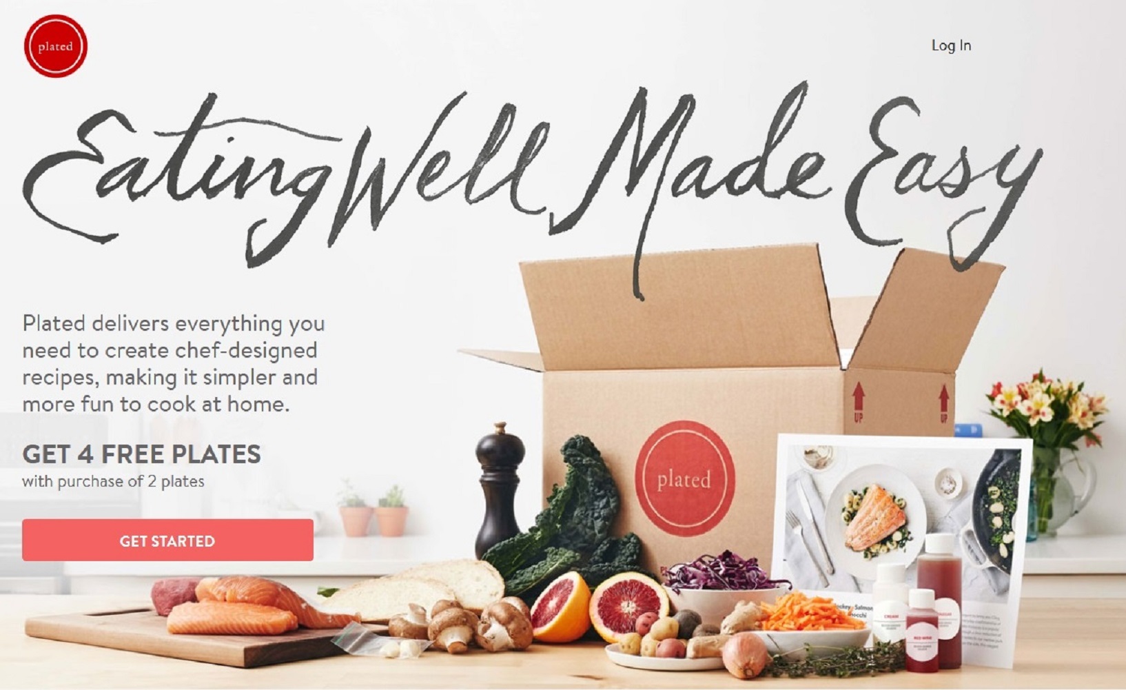
In the example below, the value proposition ‘Eating Well Made Easy’ communicates that customers will enjoy good food with less effort. It is more appealing to something generic as ‘We Deliver Fresh Ingredients to Your Home’.
A punchy value-stating headline captures attention instantly and encourages visitors to learn more about your offerings. Spend time on perfecting the headline and test different headlines to see which ones get higher sign-ups. Some elements you can test for are:
- A short versus long headline
- A headline that states benefits versus features
- The color scheme of the headline
- Headline transposed over a background image versus negative space for text and image above, below or next to it
Make a second offer to people who leave your landing page. Consider an exit overlay, a modal lightbox that tracks abandoning visitors and gets activated in the same browsing window, unlike a pop-up. This second offer can take the form of a discount or free tips/advice.
2. Include benefits and/or features
Naturally, visitors will want to know what is in it for them. A landing page is incomplete without the benefits or features of your offerings. They can be stated in different ways : as bullet points, as bite-sized chunks of text, or as small paragraphs following a logical sequence and broken up with bullets or images.
Benefits must be crisp and to-the-point. Brevity is key here; and you have only so much space to get your point across. The landing page layout and the interaction of its different elements must be thoughtfully implemented to preserve the impact of text and media content.
 .
.
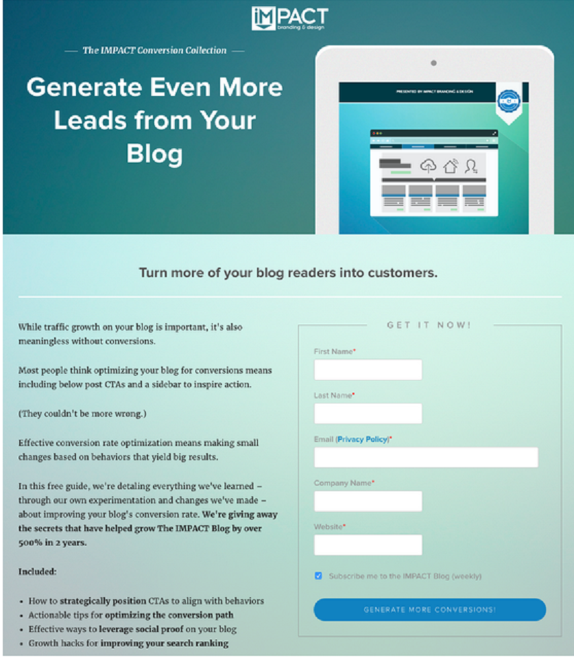
IMPACT’s landing page has a tasteful design with benefits stated on one side of the page, and supported by an effective headline and CTA.
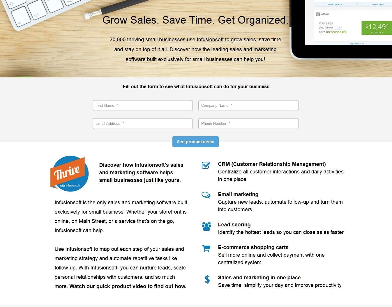
Infusionsoft includes the features of its software and has two calls to action – one is the sign-up form, and the other a product demo. The layout is well-organized and not too text heavy, and therefore, not overwhelming.
3. Reinforce your value with an effective call to action
If your value proposition and benefits have made an impact on visitors, they won’t hesitate to fill up your form. However, for those doubting Thomases or unsure visitors who still need a push, your CTA form or button can be the good angel that whispers ‘do it’! So, it makes sense to create an effective call-to-action statement and include a powerful image.
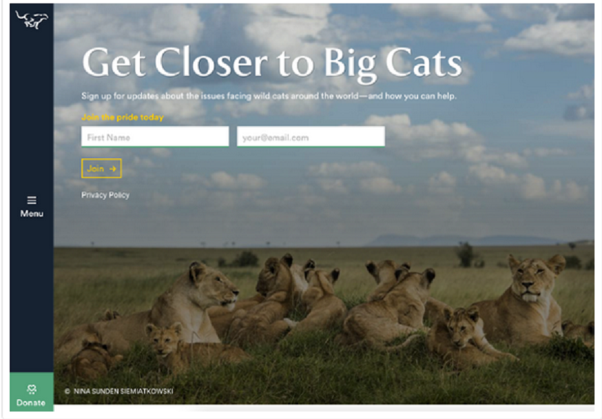
In the example below, charity organization Panthera combines a simple sign-up form with an irresistible image that conveys their mission and reminds visitors how they can make a difference. Their CTA copy is clever and resonates with the ideal customer.
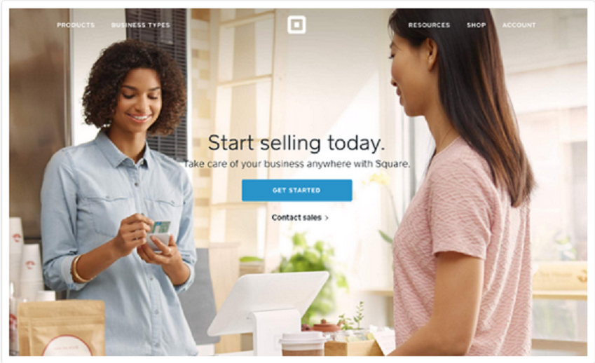
Square’s call to action is punchy and straightforward, stating the benefit and the ease of doing business with the mobile payments company. The background image is apt and the ‘get started’ button is well contrasted to catch the eye so visitors can proceed right along.
Make sure that visitors don’t have to jump through hoops to sign up or get their free trial. Avoid asking too many questions and don’t bombard them with other offers during the registration process.
4. Stay on message
Customers who clicked on the link leading to your landing page did it with a specific expectation. Your landing page must deliver what the link text promised. Avoid setting visitors up for disappointment – you’ll only be losing credibility and only a handful of visitors will actually consider reading the page (most will simply leave).
The copy from the source link and that on your landing page must be well matched. For instance, the CTA message in the ad copy or link cannot say ‘Get 40 per cent off on Graphics Cards’ while the landing page headline reads ‘Welcome to X Hardware Store’. The matching headline can look something like this : ‘40% Off Graphics Cards at X Hardware Store’.
5. Present social proof
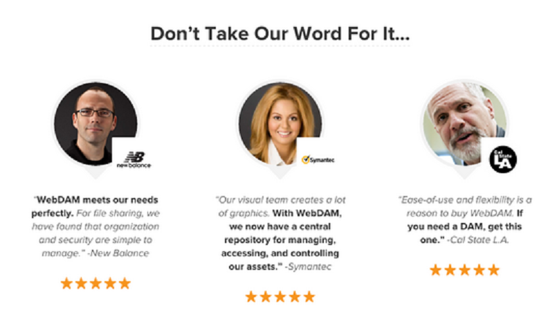
The easiest way to incorporate social proof on the landing page is through customer testimonials. Make sure you include the name, photo and designation of customers for authenticity. If there is some way to review your product or service on a popular rating site or if you allow customers to rate your product/service as part of your feedback system, showcase the five star ratings alongside customer comments.
Save time managing your social media accounts
Are you still managing your social media accounts directly from Facebook/Twitter/LinkedIn? Make your life easier by managing all your social media in one place, schedule posts, repeat posts, curate content and more. Try DrumUp now, it's free, forever.
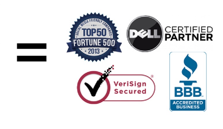
6. Add trust signals
How trustworthy are you? How strong is your client base? Like social proof, trust markers give visitors confidence that you’re a reliable company. This is also easy – just reserve some space on your landing page for client logos, preferring well-recognized companies over lesser known names.
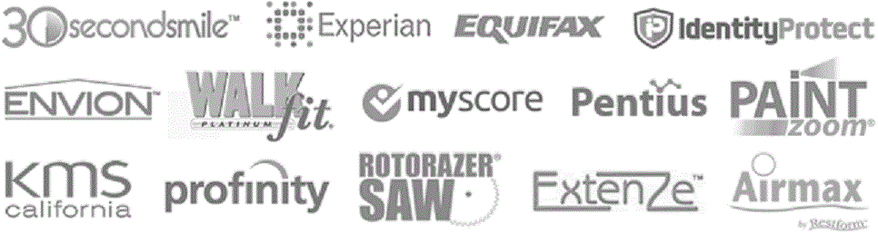
If your customers will be sharing their financial information on your site, include trust seals that offer assurance that their data will be appropriately encrypted and secured. A third trust signal is your affiliation with key industry associations/coalitions.
What Not to Add to Your Landing Page
- Too many offers or links
- Big blocks of text (state key messages in headlines and subheads)
- Distracting elements such as automatic sliders or jazzy banners
- Fluffy words and terms that lower credibility
Social media buttons that make your landing page shareable can be either a hit or miss. Test conversion rates with and without the buttons to see which approach works better for you.
Consider social media buttons for a landing page that has been created for a new offer/campaign. If you have employee advocacy programs in place, social sharing can grab more eyeballs to your brand content and latest campaigns.
Image Credit : Giphy


