How to Create Irresistible Blog Graphics Effortlessly (A Guide for Non-Designers)

They say that the pen is mightier than the sword. While this is true in most cases, social media marketers have proved that there is something mightier than the pen – and that’s pictures. Images have long been a favored means of marketing. Today, the value of images is so high, that more than 37% of marketers feel their visual content marketing has a stronger impact on consumer purchase decisions than blogging.
Graphics add a lot of value to blog posts and websites. Some of the benefits of creating blog graphics are:
- Images encourage audiences to share the post on social media
- You can validate your text easily with supporting graphics
- Blogs can be made memorable and engaging with the help of graphics
- Emotional imagery can have a lasting impact on your audience
- Tagged images create an opportunity to improve SEO
Create stunning images with the click of a button
While there are millions of stock images that you will find online, sometimes the images best suited to your content are the ones you create yourself. The availability of image editing tools has made graphic designing easier and more accessible. Today, we even have photo editing tools within social media management tools, like DrumUp which help us create unique images while scheduling social media content. Now, you don’t need to go in search of two separate tools for graphic designing and social media scheduling; a single tool will help you on both counts.
Use this how-to guide to create brilliant graphics for your blog posts and social media marketing campaigns:
1. Work with emotion and not objects
Many social media managers use stock image repositories like Pixabay or Pexels as their go-to source for blog and social media graphics. If everybody’s doing it, you have to do something different to stand out. Here’s a neat hack. Instead of searching the stock photo database with a typical, lifeless keyword, try and use keywords that are indicative of emotion or action. It’s in human nature to be more affected by emotion-riddled images and human faces.
Using emotion-focused blog or social media graphics also pushes the writer to create such a headline; and creating emotion-based headlines is a necessity in today’s social media community. In a community where the volume of data is high and people’s attention spans are low, emotion can clear the way to substantial mindshare.
Consider for instance, the following posts. They’re great examples of emotion-based headline and blog graphic creation.

2. Use infographics or GIFs to catch readers’ attention
A blog that uses infographics enjoys a readership that is 30 times higher than a blog that only contains text. Instead of using plain images, why not create stunning infographics using icons, text and engaging concepts? The right infographic icons can make your blog graphics look minimalistic and amazing, and save space by conveying more in less space.
Infographic icons that have circular or square backgrounds look more aesthetically pleasing than others. Here are some other things to remember while working on infographics with infographic icons:
 .
.
- Use labels to tell your audience what a particular graphic represents, if you aren’t confident of the icon you are using. This ensures that there is context associated with your graphic. Consider the universality of any icon before using it. If you think that one particular icon has two possible interpretations, don’t use it.
- Add shapes in the background of your icons and infographics. This will make the graphic look more defined, organized and put-together.
- Use contrasting colors and backgrounds to put your core message into focus.
- Oversizing the icons will help if you have limited content to work with. It will also help with catching the attention of easily distracted internet users.
It’s not just infographics that you can use. You could also use fun GIFs in context for eye-catching blog headers.
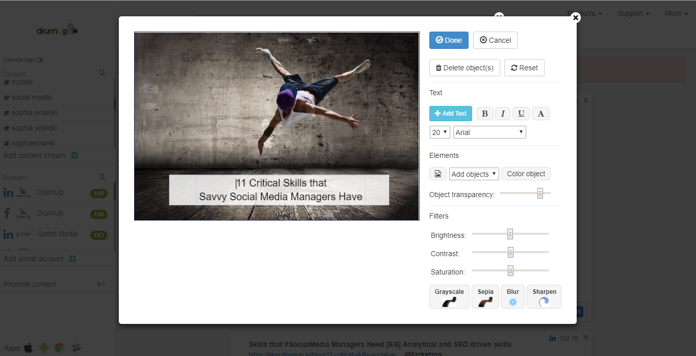
DrumUp allows users to create simple but stunning blog graphics and add text to stock images to make them more striking.
3. Pay attention to font styles and color-palettes
Fonts and typefaces have been found to impact the perception of readers. If you are writing a company-owned blog, use typefaces such as Times New Roman or Helvetica because they look very professional. If you’re creating a poster or an advertisement, why not try out Trajan? For headers and logos, Bodoni and Didot are fonts that will create the best results. Don’t believe me? Take a look at the Vogue masthead – it’s pure Didot.
The colors of your font also create an impact. Too much black creates negative feelings and colors such as yellow, orange and blue make people happy. Combine the right font with the right color and you have a recipe for success.
4. Grab attention with the headlines
Headers are extremely important to grab your audience’s attention. In fact, according to a study by the Stanford Persuasive Technology Lab, 46% of respondents only visit a blog or a website if their design, graphics and headers look aesthetically pleasing and authentic.
Creating stunning headers is extremely easy. For example, select an image and upload it into your graphic design tool. Once you edit the image, it’s time to add the text. From sassy quotes to serious statistics, you can add any text you want. Try to limit the character limit to 55, as short does translate to attractive in the blogging world. Add a detailed subtitle if you want to convey the gist of your blogpost.
Crop out any unnecessary parts of the image and resize where necessary. Remember that blog headers should be to-the-point and creative. Typographical images are absolutely amazing for this. With their beautiful designs and brilliant quotes, these are best used in headers and featured pictures. They are sure to grab your audience’s’ attention.
Graphic design tools and software such as Canva and Tiny PNG are perfect for creating beautiful featured images and headers. (P.S, you can also add stylistic headers on DrumUp’s photo editing tool).

5. Don’t turn a blind eye to color psychology
Colors affect everything, right from purchase decisions to blog readership. It’s important to use colors which make your audience feel happy and positive. Tools such as Photoscape and DrumUp have various color schemes and palettes that users can choose. From changing the background color to experimenting with contrast and brightness, you can use multiple features to enhance the appearance of your image. You can also use Adobe Color.
Color influences behavior. It’s been observed that some colors elicit positive responses and make audiences more likely to read a blogpost or share it. Take the color blue for example. Blue is considered gender-neutral and safe. A recent study by the University of Maryland indicated that 29% of women and 42% of men preferred the color blue. This is followed by purple for women and green for men. If your blog is gender specific, choosing colors that appeal to particular genders will increase the likelihood of your blog being noticed and your post being shared.
If your blog or website caters to specific countries or cultures, choose colors that have symbolic meaning to the audience. For example, red is a color that is associated with marriage and fertility in India; but in South Africa, it represents mourning and death.
Some colors such as green (which symbolizes abundance and fertility) and purple (which represents luxury and royalty) are culture-neutral. Using colors based on your audience characteristics and your blog content will increase your share-ability.
Choose colors that complement
Graphics look best when you have contrasting colors. If your text is black, your background should be white or red. Ideally, the text and the image shouldn’t clash. Tools such as Fiverr and PicMonkey allow users to experiment with contrast.
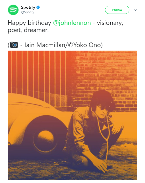
Of late, many brands have been using Dutones to make their visuals standout on social media. Here’s an example of what Spotify did with one of their social media posts.
Save time managing your social media accounts
Are you still managing your social media accounts directly from Facebook/Twitter/LinkedIn? Make your life easier by managing all your social media in one place, schedule posts, repeat posts, curate content and more. Try DrumUp now, it's free, forever.
Using complementary colors will make your blog more legible and readable. Visual hierarchy is easy to establish when you use colors that look good with each other. When thinking about the right color scheme for your blog, consider color pairing. Good examples would be gold and black or brown and orange.
It’s all about the balance
How you align your text and icons is extremely important to the success of your graphic. There are two basic types of alignment in graphic designing – edge alignment and center alignment.
Here are some points that you need to keep in mind, while planning your alignments for graphics:
- Edge alignments look great on infographics or images, as headers. But, remember to use edge alignments only if your images and objects have flat surfaces.
- If you wish to add a cluster of images together, use center alignment. This will add focus on the images.
When it comes to the text within the image, you can consider using:
- Justify – for formal headings and banner heads
- Right alignment – to create a quirky look
- Center alignment – when the text is to be written in circular or rectangular objects and icons
- Left alignment – when you want a simple design
Some tools such as DrumUp’s image editor have features where you can insert objects into graphics. You can even play around with the transparency of the object and insert other images or text within them.
Bonus tips to create graphics –
- Make the most of the tools at your disposal. Many graphic design and photo editing tools offer stock backdrops and design elements that are very easy to work with.
- Avoid stuffing designs into your images. That just makes your image look cluttered and loud.
- Keep your background images simple. Don’t take the attention away from the content.
By using the right social media and image editing tool, you can find yourself becoming better at creating irresistible graphics. Now, you neither have to be a graphic designer nor do you need to possess specialized knowledge to create beautiful and engaging graphics.
Feature image via Pexels.com
Author bio: Nisha Prakash is Content Writer at Godot Media, a leading content agency.


